Our client, a grocery retailer, wants to utilize Machine Learning to reduce mailing costs, and improve its Return on Investment (ROI)!
Table of contents
- 00. Project Overview
- 01. Data Overview
- 02. Modelling Overview
- 03. Logistic Regression
- 04. Decision Tree
- 05. Random Forest
- 06. KNN
- 07. Modelling Summary
- 08. Application
- 09. Growth & Next Steps
Project Overview
Context
A grocery retailer, sent out mailers in a marketing campaign for their new delivery club. This costed customers $100 per year for membership and offered free grocery deliveries, rather than the normal cost of $10 per delivery.
For this, they sent mailers to their entire customer base (apart from a control group) but this proved expensive. For the next batch of communications, they would like to save costs by only mailing customers that were likely to sign up.
Based on the results of the last campaign and the customer data available, I used Machine Learning algorithms to understand the probability of customers signing up for the delivery club. This would allow the client to mail a more targeted selection of customers, lowering costs, and improving ROI.
Actions
I first needed to compile the necessary data from tables in the database, gathering key customer metrics that might help predict delivery club membership.
As I was predicting a binary output, I tested four classification modeling approaches, namely:
- Logistic Regression
- Decision Tree
- Random Forest
- K Nearest Neighbours (KNN)
For each model, I imported the data in the same way but needed to pre-process the data based on the requirements of each particular algorithm. I trained & tested each model, refined each to provide optimal performance, and then measured this predictive performance based on several metrics to give a well-rounded overview of which is best.
___
Data Overview
I predicted the binary signup_flag metric from the campaign_data table in the client database.
The key variables hypothesized to predict this came from the client database, namely the transactions table, the customer_details table, and the product_areas table.
Customer data was aggregated from the 3 months before the last campaign.
After this data pre-processing in Python, I had a dataset for modeling that contained the following fields…
| Variable Name | Variable Type | Description |
|---|---|---|
| signup_flag | Dependent | A binary variable showing if the customer signed up for the delivery club in the last campaign |
| distance_from_store | Independent | The distance in miles from the customer’s home address, and the store |
| gender | Independent | The gender provided by the customer |
| credit_score | Independent | The customer’s most recent credit score |
| total_sales | Independent | Total spend by the customer in ABC Grocery - 3 months pre-campaign |
| total_items | Independent | Total products purchased by the customer in ABC Grocery - 3 months pre-campaign |
| transaction_count | Independent | Total unique transactions made by the customer in ABC Grocery - 3 months pre-campaign |
| product_area_count | Independent | The number of product areas within ABC Grocery the customers have shopped into - 3 months pre-campaign |
| average_basket_value | Independent | The average spend per transaction for the customer in ABC Grocery - 3 months pre-campaign |
Modelling Overview
I built a model that looked to accurately predict signup_flag, based upon the customer metrics listed above.
If that could be achieved, I could use this model to predict signup & signup probability for future campaigns. This information could be used to target those more likely to sign up, reducing marketing costs and thus increasing ROI.
Logistic Regression
I utilized the scikit-learn library within Python to model my data using Logistic Regression.
# Import required packages
import pandas as pd
import pickle
import matplotlib.pyplot as plt
import numpy as np
from sklearn.linear_model import LogisticRegression
from sklearn.utils import shuffle
from sklearn.model_selection import train_test_split, cross_val_score, KFold
from sklearn.metrics import confusion_matrix, accuracy_score, precision_score, recall_score, f1_score
from sklearn.preprocessing import OneHotEncoder
from sklearn.feature_selection import RFECV
The code sections below were broken up into 5 key sections:
- Data Import
- Data Preprocessing
- Model Training
- Performance Assessment
- Optimal Threshold Analysis
Data Import
Since I had saved my modeling data as a pickle file, I imported it.
# Import modeling data
data_for_model = pickle.load(open("data/delivery_club_modelling.p", "rb"))
I then removed the id column and shuffled the data.
# Drop unnecessary columns
data_for_model.drop("customer_id", axis = 1, inplace = True)

# Shuffle data
data_for_model = shuffle(data_for_model, random_state = 42)
I also investigated the class balance of my dependent variable - which was important when assessing classification accuracy.
# Assess the class balance of the dependent variable
data_for_model["signup_flag"].value_counts(normalize = True)
From the last step in the above code, I saw that 69% of customers did not sign up and 31% did. This told mes that while the data wasn’t perfectly balanced at 50:50, it wasn’t too imbalanced either. Because of this, I made sure to not rely on classification accuracy alone when assessing results - also analyzing Precision, Recall, and F1-Score.
Data Preprocessing
For Logistic Regression, I had certain data preprocessing steps that needed to be addressed, including:
- Missing values in the data
- The effect of outliers
- Encoding categorical variables to numeric form
- Multicollinearity & Feature Selection
Missing Values
# Remove rows where values are missing
data_for_model.isna().sum()
The number of missing values in the data was extremely low, so instead of applying any imputation (i.e. mean, most common value), I just removed those rows.
data_for_model.dropna(how = "any", inplace = True)
Outliers
The ability of a Logistic Regression model to generalize well across all data can be hampered if there are outliers present. There is no right or wrong way to deal with outliers, but it is always worth careful consideration - just because a value is high or low, does not necessarily mean it should not be there!
In this section, I used .describe() from Pandas to investigate the spread of values for each of our predictors. The results of this can be seen in the table below.
outlier_investigation = data_for_model.describe()
| metric | distance_from_store | credit_score | total_sales | total_items | transaction_count | product_area_count | average_basket_value |
|---|---|---|---|---|---|---|---|
| mean | 2.61 | 0.60 | 968.17 | 143.88 | 22.21 | 4.18 | 38.03 |
| std | 14.40 | 0.10 | 1073.65 | 125.34 | 11.72 | 0.92 | 24.24 |
| min | 0.00 | 0.26 | 2.09 | 1.00 | 1.00 | 1.00 | 2.09 |
| 25% | 0.73 | 0.53 | 383.94 | 77.00 | 16.00 | 4.00 | 21.73 |
| 50% | 1.64 | 0.59 | 691.64 | 123.00 | 23.00 | 4.00 | 31.07 |
| 75% | 2.92 | 0.67 | 1121.53 | 170.50 | 28.00 | 5.00 | 46.43 |
| max | 400.97 | 0.88 | 7372.06 | 910.00 | 75.00 | 5.00 | 141.05 |
Based on this investigation, I saw that the max column value was much higher than the median value for the distance_from_store, total_sales, and total_items columns.
For example, the median distance_to_store was 1.64 miles, but the maximum was over 400 miles!
Because of this, I applied some outlier removal to facilitate generalization across the full dataset.
I did this using the “boxplot approach” where I removed any rows where the values within those columns were outside of the interquartile range multiplied by 2 (Usually interquartile is multiplied by 1.5 but I multiplied it by 2 to include a wider range of data).
outlier_columns = ["distance_from_store", "total_sales", "total_items"]

# Boxplot approach
for column in outlier_columns:

    lower_quartile = data_for_model[column].quantile(0.25)
    upper_quartile = data_for_model[column].quantile(0.75)
    iqr = upper_quartile - lower_quartile
    iqr_extended = iqr * 2
    min_border = lower_quartile - iqr_extended
    max_border = upper_quartile + iqr_extended

    outliers = data_for_model[(data_for_model[column] < min_border) | (data_for_model[column] > max_border)].index
    print(f"{len(outliers)} outliers detected in column {column}")

    data_for_model.drop(outliers, inplace = True)
Split Out Data For Modeling
Here, I splitted my data into an X object which contained only the predictor (input) variables, and a y object which contained only my dependent (output) variable.
# Split data into X and y objects for modeling
X = data_for_model.drop(["signup_flag"], axis = 1)
y = data_for_model["signup_flag"]
Once I found my X and y, I splitted my data into training and test sets to ensure I could fairly validate the accuracy of the predictions on data that was not used in training. In this case, I allocated 80% of the data for training, and the remaining 20% for validation. I added in the stratify parameter to ensure that both our training and test sets had the same proportion of customers who did, and did not, sign up for the delivery club - meaning I could be more confident in my assessment of predictive performance.
# Split out training & test sets
X_train, X_test, y_train, y_test = train_test_split(X, y, test_size = 0.2, random_state = 42, stratify = y)
Categorical Predictor Variables
In my dataset, I had one categorical variable gender which had values of “M” for Male, “F” for Female, and “U” for Unknown.
The Logistic Regression algorithm can’t deal with data in this format as it can’t assign any numerical meaning to it when looking to assess the relationship between the variable and the dependent variable.
As gender doesn’t have any explicit order to it, in other words, Male isn’t higher or lower than Female and vice versa - one appropriate approach was to apply One Hot Encoding to the categorical column.
One Hot Encoding can be thought of as a way to represent categorical variables as binary vectors, in other words, a set of new columns for each categorical value with either a 1 or a 0 saying whether that value is true or not for that observation. These new columns would go into our model as input variables, and the original column is discarded.
I also dropped one of the new columns using the parameter drop = “first”. I did this to avoid the dummy variable trap where my newly created encoded columns perfectly predicted each other - and we ran the risk of breaking the assumption that there was no multicollinearity, a requirement or at least an important consideration for some models, Linear Regression being one of them! Multicollinearity occurs when two or more input variables are highly correlated with each other, it is a scenario I attemptted to avoid as in short, while it won’t neccessarily affect the predictive accuracy of my model, it could make it difficult to trust the statistics around how well the model was performing, and how much each input variable was truly having.
I then applied fit_transform to the training set, but only transform to the test set. This means the One Hot Encoding logic would learn and apply the “rules” from the training data, but only apply them to the test data. This is important in order to avoid data leakage where the test set learns information about the training data.
After applying One Hot Encoding, I turned my training and test objects back into Pandas Dataframes, with the column names applied.
# List of categorical variables that need encoding
categorical_vars = ["gender"]

# Instantiate One Hot Encoder class
one_hot_encoder = OneHotEncoder(sparse=False, drop = "first")

# Apply One Hot Encoder
X_train_encoded = one_hot_encoder.fit_transform(X_train[categorical_vars])
X_test_encoded = one_hot_encoder.transform(X_test[categorical_vars])

# Extract feature names for encoded columns
encoder_feature_names = one_hot_encoder.get_feature_names_out(categorical_vars)

# Turn objects back to the pandas dataframe
X_train_encoded = pd.DataFrame(X_train_encoded, columns = encoder_feature_names)
X_train = pd.concat([X_train.reset_index(drop=True), X_train_encoded.reset_index(drop=True)], axis = 1)
X_train.drop(categorical_vars, axis = 1, inplace = True)

X_test_encoded = pd.DataFrame(X_test_encoded, columns = encoder_feature_names)
X_test = pd.concat([X_test.reset_index(drop=True), X_test_encoded.reset_index(drop=True)], axis = 1)
X_test.drop(categorical_vars, axis = 1, inplace = True)
Feature Selection
Feature Selection is the process used to select the input variables that are most important to your Machine Learning task. It can be a very important addition or at least, a consideration, in certain scenarios. The potential benefits of Feature Selection are:
- Improved Model Accuracy - eliminating noise can help true relationships stand out
- Lower Computational Cost - our model becomes faster to train and faster to make predictions
- Explainability - understanding & explaining outputs for stakeholder & customers becomes much easier
There are many, many ways to apply Feature Selection. These range from simple methods such as a Correlation Matrix showing variable relationships, to Univariate Testing which helps us understand statistical relationships between variables, and then to even more powerful approaches like Recursive Feature Elimination (RFE) which is an approach that starts with all input variables, and then iteratively removes those with the weakest relationships with the output variable.
For this task, I applied a variation of Recursive Feature Elimination called Recursive Feature Elimination With cross-validation (RFECV) where I splitted the data into many “chunks” and iteratively trains & validates models on each “chunk” separately. This means that each time I assessed different models with different variables included, or eliminated, the algorithm also knew how accurate each of those models was. From the suite of model scenarios that were created, the algorithm could determine which provided the best accuracy, and thus could infer the best set of input variables to use!
# Instantiate RFECV & the model type to be utilized
clf = LogisticRegression(random_state = 42, max_iter = 1000)
feature_selector = RFECV(clf)

# Fit RFECV onto our training & test data
fit = feature_selector.fit(X_train,y_train)

# Extract & print the optimal number of features
optimal_feature_count = feature_selector.n_features_
print(f"Optimal number of features: {optimal_feature_count}")

# Limit our training & test sets to only include the selected variables
X_train = X_train.loc[:, feature_selector.get_support()]
X_test = X_test.loc[:, feature_selector.get_support()]
The below code then produced a plot that visualized the cross-validated classification accuracy with each potential number of features
plt.style.use('seaborn-poster')
plt.plot(range(1, len(fit.cv_results_['mean_test_score']) + 1), fit.cv_results_['mean_test_score'], marker = "o")
plt.ylabel("Classification Accuracy")
plt.xlabel("Number of Features")
plt.title(f"Feature Selection using RFECV \n Optimal number of features is {optimal_feature_count} (at score of {round(max(fit.cv_results_['mean_test_score']),4)})")
plt.tight_layout()
plt.show()
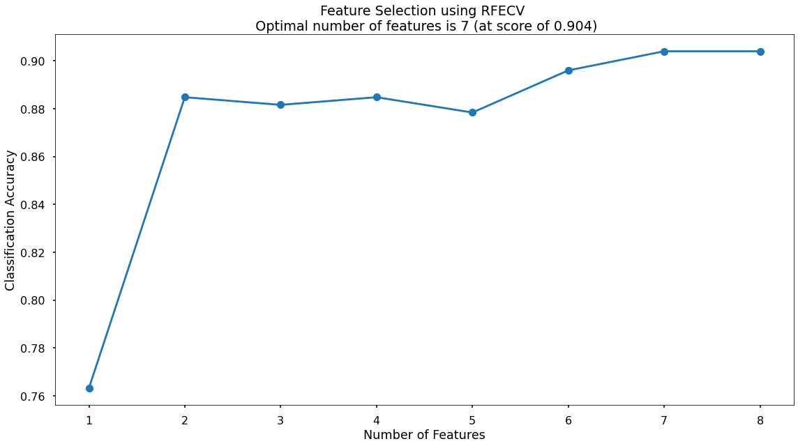
This created the below plot, which showed me that the highest cross-validated classification accuracy (0.904) was when I included seven of my original input variables. The variable that had been dropped was total_sales but from the chart I could see that the difference was negligible. However, I continued with the selected seven!
Model Training
Instantiating and training my Logistic Regression model was done using the below code. I used the random_state parameter to ensure reproducible results, meaning any refinements could be compared to past results. I also specified max_iter = 1000 to allow the solver more attempts at finding an optimal regression line, as the default value of 100 was not enough.
# Instantiate our model object
clf = LogisticRegression(random_state = 42, max_iter = 1000)

# Fit our model using our training & test sets
clf.fit(X_train, y_train)
Model Performance Assessment
Predict On The Test Set
To assess how well my model was predicting new data - I used the trained model object (here called clf) and asked it to predict the signup_flag variable for the test set.
In the code below, I created one object to hold the binary 1/0 predictions, and another to hold the actual prediction probabilities for the positive class.
# Predict on the test set
y_pred_class = clf.predict(X_test)
y_pred_prob = clf.predict_proba(X_test)[:,1]
Confusion Matrix
A Confusion Matrix provides us with a visual way to understand how our predictions match up against the actual values for those test set observations.
The below code created the Confusion Matrix using the confusion_matrix functionality from within scikit-learn and then plotted it using matplotlib.
# Create the confusion matrix
conf_matrix = confusion_matrix(y_test, y_pred_class)

# Plot the confusion matrix
plt.style.use("seaborn-poster")
plt.matshow(conf_matrix, cmap = "coolwarm")
plt.gca().xaxis.tick_bottom()
plt.title("Confusion Matrix")
plt.ylabel("Actual Class")
plt.xlabel("Predicted Class")
for (i, j), corr_value in np.ndenumerate(conf_matrix):
    plt.text(j, i, corr_value, ha = "center", va = "center", fontsize = 20)
plt.show()
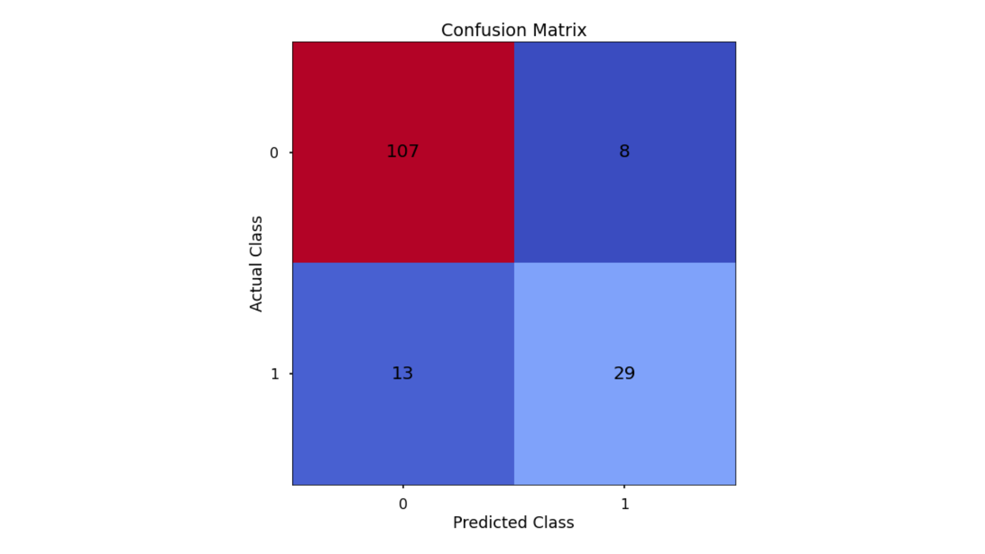
The aim was to have a high proportion of observations falling into the top left cell (predicted non-signup and actual non-signup) and the bottom right cell (predicted signup and actual signup).
Since the proportion of signups in my data was around 30:70 I analyzed not only Classification Accuracy, but also Precision, Recall, and F1-Score which helped me assess how well my model had performed in reality.
Classification Performance Metrics
Classification Accuracy
Classification Accuracy is a metric that tells us of all predicted observations, what proportion did we correctly classify. This is very intuitive, but when dealing with imbalanced classes, can be misleading.
Precision & Recall
Precision is a metric that tells us of all observations that were predicted as positive, how many actually were positive
Recall is a metric that tells us of all positive observations, how many did we predict as positive
The tricky thing about Precision & Recall is that it is impossible to optimize both - it’s a zero-sum game. If you try to increase Precision, Recall decreases, and vice versa. Sometimes however it will make more sense to try and elevate one of them, despite the other.
So - there is one more metric we will discuss & calculate, which is actually a combination of both…
F1 Score
F1-Score is a metric that essentially “combines” both Precision & Recall. Technically speaking, it is the harmonic mean of these two metrics. A good, or high, F1-Score comes when there is a balance between Precision & Recall, rather than a disparity between them.
Overall, optimizing your model for F1-Score means that you’ll get a model that is working well for both positive & negative classifications rather than skewed towards one or the other. To return to the rare disease predictions, a high F1-Score would mean we’ve got a good balance between successfully predicting the disease when it’s present, and not predicting cases where it’s not present.
Using all of these metrics in combination gives a really good overview of the performance of a classification model, and gives us an understanding of the different scenarios & considerations!
In the code below, I utilized in-built functionality from scikit-learn to calculate these four metrics.
# Classification accuracy
accuracy_score(y_test, y_pred_class)

# Precision
precision_score(y_test, y_pred_class)

# Recall
recall_score(y_test, y_pred_class)

# F1-score
f1_score(y_test, y_pred_class)
Running this code gave me:
- Classification Accuracy = 0.866 meaning I correctly predicted the class of 86.6% of test set observations
- Precision = 0.784 meaning that for my predicted delivery club signups, I was correct 78.4% of the time
- Recall = 0.69 meaning that of all actual delivery club signups, I predicted correctly 69% of the time
- F1-Score = 0.734
Since my data was somewhat imbalanced, looking at these metrics rather than just Classification Accuracy on its own - was a good idea, and gave me a much better understanding of what my predictions mean! I used these same metrics when applying other models for this task and compared how they stacked up.
Finding The Optimal Classification Threshold
By default, most pre-built classification models & algorithms will just use a 50% probability to discern between a positive class prediction (delivery club signup) and a negative class prediction (delivery club non-signup).
Just because 50% is the default threshold does not mean it is the best one for our task.
Here, I tested many potential classification thresholds, and plotted the Precision, Recall & F1-Score, and found an optimal solution!
# Set up the list of thresholds to loop through
thresholds = np.arange(0, 1, 0.01)

# Create empty lists to append the results to
precision_scores = []
recall_scores = []
f1_scores = []

# Loop through each threshold - fit the model - append the results
for threshold in thresholds:

    pred_class = (y_pred_prob >= threshold) * 1

    precision = precision_score(y_test, pred_class, zero_division = 0)
    precision_scores.append(precision)

    recall = recall_score(y_test, pred_class)
    recall_scores.append(recall)

    f1 = f1_score(y_test, pred_class)
    f1_scores.append(f1)

# Extract the optimal f1-score (and its index)
max_f1 = max(f1_scores)
max_f1_idx = f1_scores.index(max_f1)
I used the below code to plot the results!
# Plot the results
plt.style.use("seaborn-poster")
plt.plot(thresholds, precision_scores, label = "Precision", linestyle = "--")
plt.plot(thresholds, recall_scores, label = "Recall", linestyle = "--")
plt.plot(thresholds, f1_scores, label = "F1", linewidth = 5)
plt.title(f"Finding the Optimal Threshold for Classification Model \n Max F1: {round(max_f1,2)} (Threshold = {round(thresholds[max_f1_idx],2)})")
plt.xlabel("Threshold")
plt.ylabel("Assessment Score")
plt.legend(loc = "lower left")
plt.tight_layout()
plt.show()
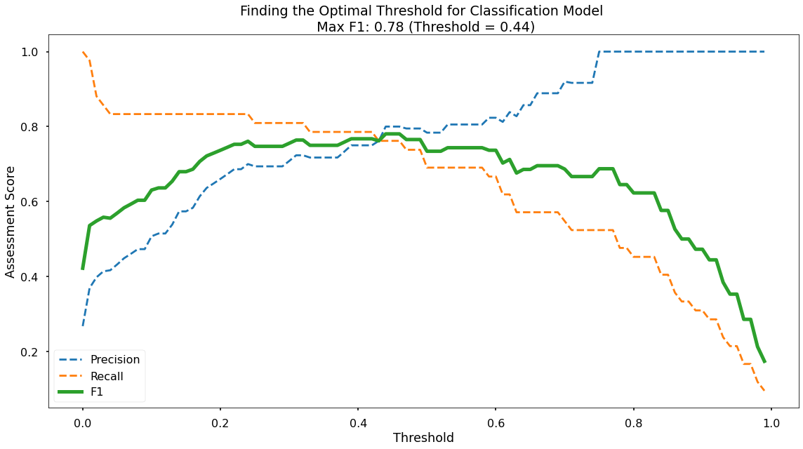
Along the x-axis of the above plot, I had the different classification thresholds that were tested. Along the y-axis, I had the performance score for each of my three metrics. As per the legend, I had Precision as a blue dotted line, Recall as an orange dotted line, and F1-Score as a thick green line. You can see the interesting “zero-sum” relationship between Precision & Recall and you can see that the point where Precision & Recall meet is where F1-Score is maximized.
As you can see at the top of the plot, the optimal F1-Score for this model is 0.78, and this was obtained at a classification threshold of 0.44. This is higher than the F1-Score of 0.734 that we achieved at the default classification threshold of 0.50!
Decision Tree
I utilized the scikit-learn library within Python to model my data using a Decision Tree. The code sections below were broken up into 6 key sections:
- Data Import
- Data Preprocessing
- Model Training
- Performance Assessment
- Tree Visualisation
- Decision Tree Regularisation
Data Import
# Import required packages
import pandas as pd
import pickle
import matplotlib.pyplot as plt
import numpy as np
from sklearn.tree import DecisionTreeClassifier, plot_tree
from sklearn.utils import shuffle
from sklearn.model_selection import train_test_split, cross_val_score, KFold
from sklearn.metrics import confusion_matrix, accuracy_score, precision_score, recall_score, f1_score
from sklearn.preprocessing import OneHotEncoder

# Import modeling data
data_for_model = pickle.load(open("data/delivery_club_modelling.p", "rb"))

# Drop unnecessary columns
data_for_model.drop("customer_id", axis = 1, inplace = True)

# Shuffle data
data_for_model = shuffle(data_for_model, random_state = 42)

# Assess the class balance of the dependent variable
data_for_model["signup_flag"].value_counts(normalize = True)
Data Preprocessing
While Logistic Regression is susceptible to the effects of outliers, and highly correlated input variables - Decision Trees are not, so the required preprocessing here is lighter. I still however put in place logic for:
- Missing values in the data
- Encoding categorical variables to numeric form
Missing Values
The number of missing values in the data was extremely low, so instead of applying any imputation (i.e. mean, most common value) we will just remove those rows
# Remove rows where values are missing
data_for_model.isna().sum()
data_for_model.dropna(how = "any", inplace = True)
Split Out Data For Modelling
In the same way I did for Logistic Regression, in the next code block I did two things, I first splitted my data into an X object which contained only the predictor variables, and a y object which contained only my dependent variable.
Once I did done this, I splitted my data into training and test sets to ensure I could fairly validate the accuracy of the predictions on data that was not used in training. In this case, I allocated 80% of the data for training, and the remaining 20% for validation. Again, I ensured to add in the stratify parameter to ensure that both my training and test sets had the same proportion of customers who did and did not, sign up for the delivery club - meaning I can be more confident in my assessment of predictive performance.
# Split data into X and y objects for modeling
X = data_for_model.drop(["signup_flag"], axis = 1)
y = data_for_model["signup_flag"]

# Split out training & test sets
X_train, X_test, y_train, y_test = train_test_split(X, y, test_size = 0.2, random_state = 42, stratify = y)
Categorical Predictor Variables
# List of categorical variables that need encoding
categorical_vars = ["gender"]

# Instantiate One Hot Encoder class
one_hot_encoder = OneHotEncoder(sparse=False, drop = "first")

# Apply One Hot Encoder
X_train_encoded = one_hot_encoder.fit_transform(X_train[categorical_vars])
X_test_encoded = one_hot_encoder.transform(X_test[categorical_vars])

# Extract feature names for encoded columns
encoder_feature_names = one_hot_encoder.get_feature_names_out(categorical_vars)

# Turn objects back to the pandas dataframe
X_train_encoded = pd.DataFrame(X_train_encoded, columns = encoder_feature_names)
X_train = pd.concat([X_train.reset_index(drop=True), X_train_encoded.reset_index(drop=True)], axis = 1)
X_train.drop(categorical_vars, axis = 1, inplace = True)

X_test_encoded = pd.DataFrame(X_test_encoded, columns = encoder_feature_names)
X_test = pd.concat([X_test.reset_index(drop=True), X_test_encoded.reset_index(drop=True)], axis = 1)
X_test.drop(categorical_vars, axis = 1, inplace = True)
Model Training
Instantiating and training the Decision Tree model was done using the below code. I used the random_state parameter to ensure I got reproducible results, and this helped me understand any improvements in performance with changes to model hyperparameters.
# Instantiate our model object
clf = DecisionTreeClassifier(random_state = 42, max_depth = 5)

# Fit our model using our training & test sets
clf.fit(X_train, y_train)
Model Performance Assessment
Predict On The Test Set
Just like we did with Logistic Regression, to assess how well my model was predicting on new data - I used the trained model object (here called clf) and ask it to predict the signup_flag variable for the test set.
In the code below I created one object to hold the binary 1/0 predictions, and another to hold the actual prediction probabilities for the positive class.
# Predict on the test set
y_pred_class = clf.predict(X_test)
y_pred_prob = clf.predict_proba(X_test)[:,1]
Confusion Matrix
The below code created the Confusion Matrix using the confusion_matrix functionality from within scikit-learn and then plots it using matplotlib.
# Create the confusion matrix
conf_matrix = confusion_matrix(y_test, y_pred_class)

# Plot the confusion matrix
plt.style.use("seaborn-poster")
plt.matshow(conf_matrix, cmap = "coolwarm")
plt.gca().xaxis.tick_bottom()
plt.title("Confusion Matrix")
plt.ylabel("Actual Class")
plt.xlabel("Predicted Class")
for (i, j), corr_value in np.ndenumerate(conf_matrix):
    plt.text(j, i, corr_value, ha = "center", va = "center", fontsize = 20)
plt.show()
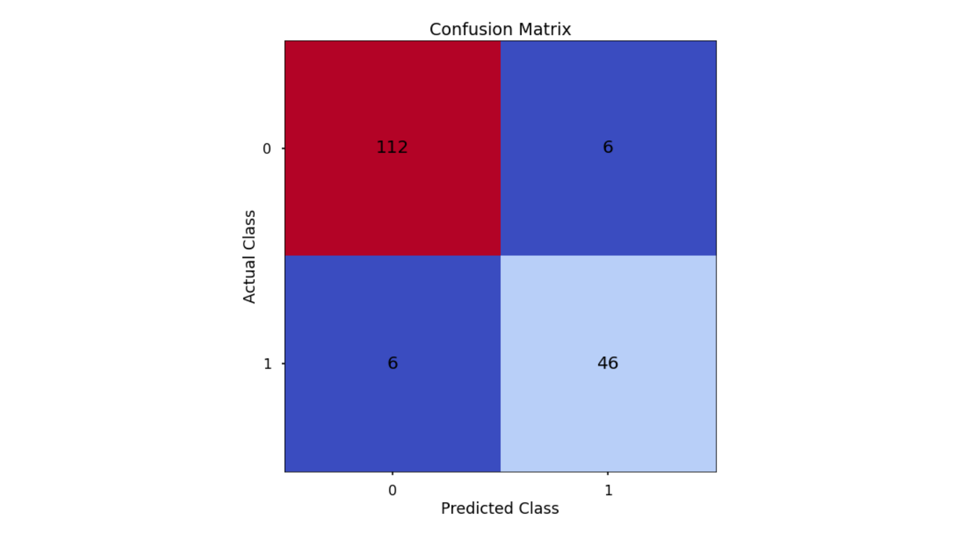
The aim was to have a high proportion of observations falling into the top left cell (predicted non-signup and actual non-signup) and the bottom right cell (predicted signup and actual signup).
Since the proportion of signups in my data was around 30:70 I again analyzed not only Classification Accuracy, but also Precision, Recall, and F1-Score to assess how well our model had performed from different points of view.
Classification Performance Metrics
Accuracy, Precision, Recall, F1-Score
In the code below, I utilized in-built functionality from scikit-learn to calculate these four metrics.
# Classification accuracy
accuracy_score(y_test, y_pred_class)

# Precision
precision_score(y_test, y_pred_class)

# Recall
recall_score(y_test, y_pred_class)

# F1-score
f1_score(y_test, y_pred_class)
Running this code gives us:
- Classification Accuracy = 0.929 meaning I correctly predicted the class of 92.9% of test set observations
- Precision = 0.885 meaning that for my predicted delivery club signups, I was correct 88.5% of the time
- Recall = 0.885 meaning that of all actual delivery club signups, I predicted correctly 88.5% of the time
- F1-Score = 0.885
These were all higher than what I saw when applying Logistic Regression, even after I had optimized the classification threshold!
Visualise Our Decision Tree
To see the decisions that was made in the tree, I used the plot_tree functionality that I imported from scikit-learn. To do this, I used the below code:
# Plot the nodes of the decision tree
plt.figure(figsize=(25,15))
tree = plot_tree(clf,
                 feature_names = X.columns,
                 filled = True,
                 rounded = True,
                 fontsize = 16)
That code gave me the below plot:
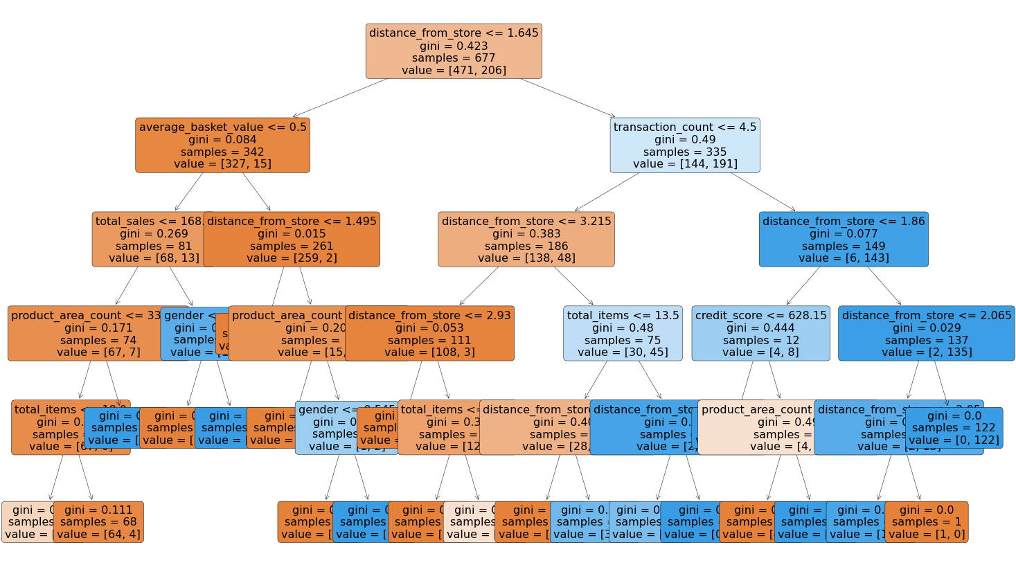
This is a very powerful visual, and one that can be shown to stakeholders in the business to ensure they understand exactly what is driving the predictions.
One interesting thing to note is that the very first split appeared to be using the variable distance from store so it would seem that this was a very important variable when it came to predicting signups to the delivery club!
Decision Tree Regularisation
Decision Trees can be prone to over-fitting, in other words, without any limits on their splitting, they will end up learning the training data perfectly. We would much prefer our model to have a more generalized set of rules, as this will be more robust & reliable when making predictions on new data.
One effective method of avoiding this over-fitting is to apply a max depth to the Decision Tree, meaning we only allow it to split the data a certain number of times before it is required to stop.
I initially trained my model with a placeholder depth of 5, but unfortunately, I didn’t necessarily know the optimal number for this. Below I looped over a variety of values and assessed which gave me the best predictive performance!
# Finding the best max_depth

# Set up range for search, and empty list to append accuracy scores to
max_depth_list = list(range(1,15))
accuracy_scores = []

# Loop through each possible depth, train and validate model, append test set f1-score
for depth in max_depth_list:

    clf = DecisionTreeClassifier(max_depth = depth, random_state = 42)
    clf.fit(X_train,y_train)
    y_pred = clf.predict(X_test)
    accuracy = f1_score(y_test,y_pred)
    accuracy_scores.append(accuracy)

# Store max accuracy, and optimal depth
max_accuracy = max(accuracy_scores)
max_accuracy_idx = accuracy_scores.index(max_accuracy)
optimal_depth = max_depth_list[max_accuracy_idx]

# Plot accuracy by max depth
plt.plot(max_depth_list,accuracy_scores)
plt.scatter(optimal_depth, max_accuracy, marker = "x", color = "red")
plt.title(f"Accuracy (F1 Score) by Max Depth \n Optimal Tree Depth: {optimal_depth} (F1 Score: {round(max_accuracy,4)})")
plt.xlabel("Max Depth of Decision Tree")
plt.ylabel("Accuracy (F1 Score)")
plt.tight_layout()
plt.show()
That code gave me the below plot - which visualized the results!
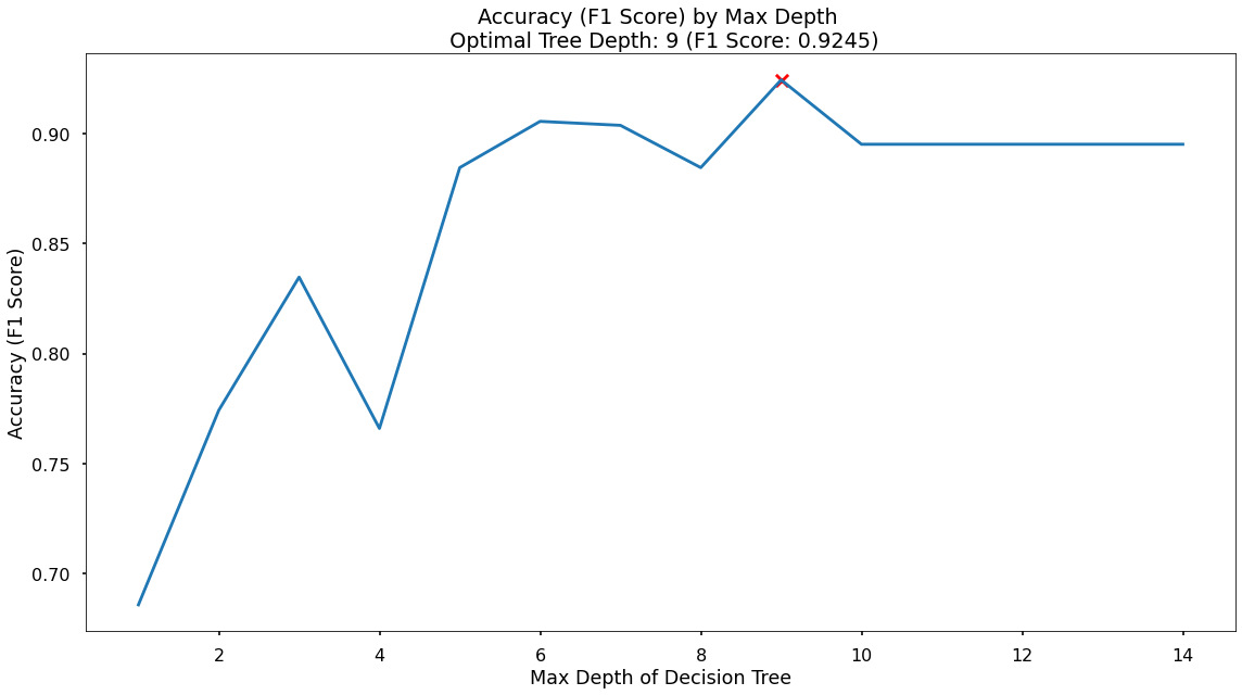
In the plot, I saw that the maximum F1-Score on the test set was found when applying a max_depth value of 9 which took my F1-Score up to 0.925
Random Forest
The code sections below was broken up into 4 key sections:
- Data Import
- Data Preprocessing
- Model Training
- Performance Assessment
Data Import
Again, since I saved my modeling data as a pickle file, I imported it. I ensured I removed the id column, and I also ensured my data was shuffled.
As this was the same process I ran for both Logistic Regression & the Decision Tree - my code also investigated the class balance of my dependent variable
# Import required packages
import pandas as pd
import pickle
import matplotlib.pyplot as plt
import numpy as np
from sklearn.ensemble import RandomForestClassifier
from sklearn.utils import shuffle
from sklearn.model_selection import train_test_split, cross_val_score, KFold
from sklearn.metrics import confusion_matrix, accuracy_score, precision_score, recall_score, f1_score
from sklearn.preprocessing import OneHotEncoder
from sklearn.inspection import permutation_importance

# Import modelling data
data_for_model = pickle.load(open("data/delivery_club_modelling.p", "rb"))

# Drop unnecessary columns
data_for_model.drop("customer_id", axis = 1, inplace = True)

# Shuffle data
data_for_model = shuffle(data_for_model, random_state = 42)
Data Preprocessing
While Linear Regression is susceptible to the effects of outliers, and highly correlated input variables - Random Forests, just like Decision Trees, are not, so the required preprocessing here is lighter. We still however will put in place logic for:
- Missing values in the data
- Encoding categorical variables to numeric form
Missing Values
The number of missing values in the data was extremely low, so instead of applying any imputation (i.e. mean, most common value), I just removed those rows. Again, this was the same process I ran for Logistic Regression & the Decision Tree.
# Remove rows where values are missing
data_for_model.isna().sum()
data_for_model.dropna(how = "any", inplace = True)
Split Out Data For Modelling
# Split data into X and y objects for modelling
X = data_for_model.drop(["signup_flag"], axis = 1)
y = data_for_model["signup_flag"]

# Split out training & test sets
X_train, X_test, y_train, y_test = train_test_split(X, y, test_size = 0.2, random_state = 42, stratify = y)
Categorical Predictor Variables
# List of categorical variables that need encoding
categorical_vars = ["gender"]

# Instantiate OHE class
one_hot_encoder = OneHotEncoder(sparse=False, drop = "first")

# Apply One Hot Encoder
X_train_encoded = one_hot_encoder.fit_transform(X_train[categorical_vars])
X_test_encoded = one_hot_encoder.transform(X_test[categorical_vars])

# Extract feature names for encoded columns
encoder_feature_names = one_hot_encoder.get_feature_names_out(categorical_vars)

# Turn objects back to the pandas dataframe
X_train_encoded = pd.DataFrame(X_train_encoded, columns = encoder_feature_names)
X_train = pd.concat([X_train.reset_index(drop=True), X_train_encoded.reset_index(drop=True)], axis = 1)
X_train.drop(categorical_vars, axis = 1, inplace = True)

X_test_encoded = pd.DataFrame(X_test_encoded, columns = encoder_feature_names)
X_test = pd.concat([X_test.reset_index(drop=True), X_test_encoded.reset_index(drop=True)], axis = 1)
X_test.drop(categorical_vars, axis = 1, inplace = True)
Model Training
Instantiating and training the Random Forest model was done using the below code. I used the random_state parameter to ensure I got reproducible results, and this helped me understand any improvements in performance with changes to model hyperparameters.
I also looked to build more Decision Trees in the Random Forest (500) than would be done using the default value of 100.
Lastly, since the default scikit-learn implementation of Random Forests does not limit the number of randomly selected variables offered up for splitting at each split point in each Decision Tree - I put this in place using the max_features parameter. This can always be refined later through testing, or an approach such as gridsearch.
# Instantiate our model object
clf = RandomForestClassifier(random_state = 42, n_estimators = 500, max_features = 5)

# Fit our model using our training & test sets
clf.fit(X_train, y_train)
Model Performance Assessment
Predict On The Test Set
I used the trained model object (here called clf) and asked it to predict the signup_flag variable for the test set.
In the code below I created one object to hold the binary 1/0 predictions, and another to hold the actual prediction probabilities for the positive class.
# Predict on the test set
y_pred_class = clf.predict(X_test)
y_pred_prob = clf.predict_proba(X_test)[:,1]
Confusion Matrix
The below code created the Confusion Matrix using the confusion_matrix functionality from within scikit-learn and then plotted it using matplotlib.
# Create the confusion matrix
conf_matrix = confusion_matrix(y_test, y_pred_class)

# Plot the confusion matrix
plt.style.use("seaborn-poster")
plt.matshow(conf_matrix, cmap = "coolwarm")
plt.gca().xaxis.tick_bottom()
plt.title("Confusion Matrix")
plt.ylabel("Actual Class")
plt.xlabel("Predicted Class")
for (i, j), corr_value in np.ndenumerate(conf_matrix):
    plt.text(j, i, corr_value, ha = "center", va = "center", fontsize = 20)
plt.show()

Classification Performance Metrics
Accuracy, Precision, Recall, F1-Score
# Classification accuracy
accuracy_score(y_test, y_pred_class)

# Precision
precision_score(y_test, y_pred_class)

# Recall
recall_score(y_test, y_pred_class)

# F1-score
f1_score(y_test, y_pred_class)
Running this code gives us:
- Classification Accuracy = 0.935 meaning I correctly predicted the class of 93.5% of test set observations
- Precision = 0.887 meaning that for my predicted delivery club signups, I was correct 88.7% of the time
- Recall = 0.904 meaning that of all actual delivery club signups, I predicted correctly 90.4% of the time
- F1-Score = 0.895
These were all higher than what I saw when applying Logistic Regression, and marginally higher than what I got from my Decision Tree. If I was after out-and-out accuracy then this would be the best model to choose. If I was happier with a simpler, easier explain model, that had almost the same performance - then I maight choose the Decision Tree instead!
Feature Importance
Random Forests are an ensemble model, made up of many, many Decision Trees, each of which is different due to the randomness of the data being provided, and the random selection of input variables available at each potential split point.
Because of this, we end up with a powerful and robust model, but because of the random or different nature of all these Decision trees - the model gives us a unique insight into how important each of our input variables is to the overall model.
As we’re using random samples of data, and input variables for each Decision Tree - there are many scenarios where certain input variables are being held back and this enables us a way to compare how accurate the models’ predictions are if that variable is or isn’t present.
So, at a high level, in a Random Forest, we can measure importance by asking How much would accuracy decrease if a specific input variable was removed or randomized?
If this decrease in performance, or accuracy, is large, then we’d deem that input variable to be quite important, and if we see only a small decrease in accuracy, then we’d conclude that the variable is of less importance.
At a high level, there are two common ways to tackle this. The first, often just called Feature Importance is where we find all nodes in the Decision Trees of the forest where a particular input variable is used to split the data and assess what the gini impurity score (for a Classification problem) was before the split was made, and compare this to the gini impurity score after the split was made. We can take the average of these improvements across all Decision Trees in the Random Forest to get a score that tells us how much better we’re making the model by using that input variable.
If we do this for each of our input variables, we can compare these scores and understand which is adding the most value to the predictive power of the model!
The other approach, often called Permutation Importance cleverly uses some data that has gone unused at when random samples are selected for each Decision Tree (this stage is called “bootstrap sampling” or “bootstrapping”)
These observations that were not randomly selected for each Decision Tree are known as Out of Bag observations and these can be used for testing the accuracy of each particular Decision Tree.
For each Decision Tree, all of the Out of Bag observations are gathered and then passed through. Once all of these observations have been run through the Decision Tree, we obtain a classification accuracy score for these predictions.
To understand the importance, we randomize the values within one of the input variables - a process that essentially destroys any relationship that might exist between that input variable and the output variable - and run that updated data through the Decision Tree again, obtaining a second accuracy score. The difference between the original accuracy and the new accuracy gives us a view on how important that particular variable is for predicting the output.
Permutation Importance is often preferred over Feature Importance which can at times inflate the importance of numerical features. Both are useful and in most cases will give fairly similar results.
I put them both in place and plotted the results…
# Calculate feature importance
feature_importance = pd.DataFrame(clf.feature_importances_)
feature_names = pd.DataFrame(X.columns)
feature_importance_summary = pd.concat([feature_names,feature_importance], axis = 1)
feature_importance_summary.columns = ["input_variable","feature_importance"]
feature_importance_summary.sort_values(by = "feature_importance", inplace = True)

# Plot feature importance
plt.barh(feature_importance_summary["input_variable"],feature_importance_summary["feature_importance"])
plt.title("Feature Importance of Random Forest")
plt.xlabel("Feature Importance")
plt.tight_layout()
plt.show()

# Calculate permutation importance
result = permutation_importance(clf, X_test, y_test, n_repeats = 10, random_state = 42)
permutation_importance = pd.DataFrame(result["importances_mean"])
feature_names = pd.DataFrame(X.columns)
permutation_importance_summary = pd.concat([feature_names,permutation_importance], axis = 1)
permutation_importance_summary.columns = ["input_variable","permutation_importance"]
permutation_importance_summary.sort_values(by = "permutation_importance", inplace = True)

# Plot permutation importance
plt.barh(permutation_importance_summary["input_variable"],permutation_importance_summary["permutation_importance"])
plt.title("Permutation Importance of Random Forest")
plt.xlabel("Permutation Importance")
plt.tight_layout()
plt.show()
That code gave me the below plots - the first being for Feature Importance and the second for Permutation Importance!
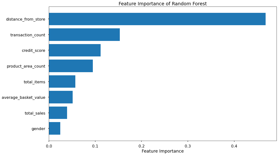
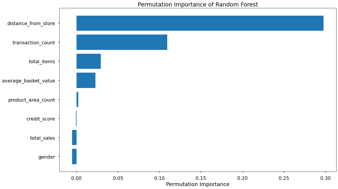
The overall story from both approaches is very similar, in that by far, the most important or impactful input variables are distance_from_store and transaction_count
Surprisingly, average_basket_size was not as important as hypothesized.
There were slight differences in the order or “importance” of the remaining variables but overall they had provided similar findings.
K Nearest Neighbours
We utilized the scikit-learn library within Python to model our data using KNN. The code sections below were broken up into 5 key sections:
- Data Import
- Data Preprocessing
- Model Training
- Performance Assessment
- Optimal Value For K
Data Import
Again, since I saved my modeling data as a pickle file, I imported it. I ensured I removed the id column, and I also ensured my data was shuffled.
As with the other approaches, I also investigated the class balance of our dependent variable - which was important when assessing classification accuracy.
# Import required packages
import pandas as pd
import pickle
import matplotlib.pyplot as plt
import numpy as np
from sklearn.neighbors import KNeighborsClassifier
from sklearn.utils import shuffle
from sklearn.model_selection import train_test_split, cross_val_score, KFold
from sklearn.metrics import confusion_matrix, accuracy_score, precision_score, recall_score, f1_score
from sklearn.preprocessing import OneHotEncoder, MinMaxScaler
from sklearn.feature_selection import RFECV

# Import modeling data
data_for_model = pickle.load(open("data/delivery_club_modelling.p", "rb"))

# Drop unnecessary columns
data_for_model.drop("customer_id", axis = 1, inplace = True)

# Shuffle data
data_for_model = shuffle(data_for_model, random_state = 42)

# Assess the class balance of the dependent variable
data_for_model["signup_flag"].value_counts(normalize = True)
Data Preprocessing
For KNN, as it is a distance-based algorithm, we have certain data preprocessing steps that need to be addressed, including:
- Missing values in the data
- The effect of outliers
- Encoding categorical variables to numeric form
- Feature Scaling
- Feature Selection
Missing Values
The number of missing values in the data was extremely low, so instead of applying any imputation (i.e. mean, most common value) I just removed those rows
# Remove rows where values are missing
data_for_model.isna().sum()
data_for_model.dropna(how = "any", inplace = True)
Outliers
As KNN is a distance-based algorithm, you could argue that if a data point is a long way away, then it will simply never be selected as one of the neighbors - and this is true - but outliers can still cause us problems here. The main issue we face is when we come to scale our input variables, a very important step for a distance-based algorithm.
We don’t want any variables to be “bunched up” due to a single outlier value, as this will make it hard to compare their values to the other input variables. We should always investigate outliers rigorously - in this case, we will simply remove them.
In this code section, just like we saw when applying Logistic Regression, I used .describe() from Pandas to investigate the spread of values for each of my predictors. The results of this can be seen in the table below.
| metric | distance_from_store | credit_score | total_sales | total_items | transaction_count | product_area_count | average_basket_value |
|---|---|---|---|---|---|---|---|
| mean | 2.61 | 0.60 | 968.17 | 143.88 | 22.21 | 4.18 | 38.03 |
| std | 14.40 | 0.10 | 1073.65 | 125.34 | 11.72 | 0.92 | 24.24 |
| min | 0.00 | 0.26 | 2.09 | 1.00 | 1.00 | 1.00 | 2.09 |
| 25% | 0.73 | 0.53 | 383.94 | 77.00 | 16.00 | 4.00 | 21.73 |
| 50% | 1.64 | 0.59 | 691.64 | 123.00 | 23.00 | 4.00 | 31.07 |
| 75% | 2.92 | 0.67 | 1121.53 | 170.50 | 28.00 | 5.00 | 46.43 |
| max | 400.97 | 0.88 | 7372.06 | 910.00 | 75.00 | 5.00 | 141.05 |
Again, based on this investigation, I saw some max column values for several variables to be much higher than the median value.
This was for columns distance_from_store, total_sales, and total_items
For example, the median distance_to_store was 1.64 miles, but the maximum was over 400 miles!
Because of this, I applied some outlier removal to facilitate generalization across the full dataset.
I did this using the “boxplot approach” where I removed any rows where the values within those columns were outside of the interquartile range multiplied by 2.
outlier_investigation = data_for_model.describe()
outlier_columns = ["distance_from_store", "total_sales", "total_items"]

# Boxplot approach
for column in outlier_columns:

    lower_quartile = data_for_model[column].quantile(0.25)
    upper_quartile = data_for_model[column].quantile(0.75)
    iqr = upper_quartile - lower_quartile
    iqr_extended = iqr * 2
    min_border = lower_quartile - iqr_extended
    max_border = upper_quartile + iqr_extended

    outliers = data_for_model[(data_for_model[column] < min_border) | (data_for_model[column] > max_border)].index
    print(f"{len(outliers)} outliers detected in column {column}")

    data_for_model.drop(outliers, inplace = True)
Split Out Data For Modelling
# Split data into X and y objects for modeling
X = data_for_model.drop(["signup_flag"], axis = 1)
y = data_for_model["signup_flag"]

# Split out training & test sets
X_train, X_test, y_train, y_test = train_test_split(X, y, test_size = 0.2, random_state = 42, stratify = y)
Categorical Predictor Variables
# List of categorical variables that need encoding
categorical_vars = ["gender"]

# Instantiate One Hot Encoder class
one_hot_encoder = OneHotEncoder(sparse=False, drop = "first")

# Apply One Hot Encoder
X_train_encoded = one_hot_encoder.fit_transform(X_train[categorical_vars])
X_test_encoded = one_hot_encoder.transform(X_test[categorical_vars])

# Extract feature names for encoded columns
encoder_feature_names = one_hot_encoder.get_feature_names_out(categorical_vars)

# Turn objects back to the pandas dataframe
X_train_encoded = pd.DataFrame(X_train_encoded, columns = encoder_feature_names)
X_train = pd.concat([X_train.reset_index(drop=True), X_train_encoded.reset_index(drop=True)], axis = 1)
X_train.drop(categorical_vars, axis = 1, inplace = True)

X_test_encoded = pd.DataFrame(X_test_encoded, columns = encoder_feature_names)
X_test = pd.concat([X_test.reset_index(drop=True), X_test_encoded.reset_index(drop=True)], axis = 1)
X_test.drop(categorical_vars, axis = 1, inplace = True)
Feature Scaling
As KNN is a distance-based algorithm, in other words, it is reliant on an understanding of how similar or different data points are across different dimensions in n-dimensional space, the application of Feature Scaling is extremely important.
Feature Scaling is where we force the values from different columns to exist on the same scale, to enhance the learning capabilities of the model. There are two common approaches to this, Standardisation, and Normalisation.
Standardization rescales data to have a mean of 0, and a standard deviation of 1 - meaning most data points will most often fall between values of around -4 and +4.
Normalization rescales data points so that they exist in a range between 0 and 1.
The below code uses the in-built MinMaxScaler functionality from scikit-learn to apply Normalisation to all of our input variables. The reason we choose Normalisation over Standardisation is that our scaled data will all exist between 0 and 1, and these will then be compatible with any categorical variables that we have encoded as 1’s and 0’s.
In the code, I also made sure to apply fit_transform to the training set, but only transform to the test set. This means the scaling logic will learn and apply the scaling “rules” from the training data, but only apply them to the test data (or any other data we predict in the future). This is important to avoid data leakage where the test set learns information about the training data, and means we can’t fully trust model performance metrics!
# Create our scaler object
scale_norm = MinMaxScaler()

# Normalise the training set (using fit_transform)
X_train = pd.DataFrame(scale_norm.fit_transform(X_train), columns = X_train.columns)

# Normalise the test set (using transform only)
X_test = pd.DataFrame(scale_norm.transform(X_test), columns = X_test.columns)
Feature Selection
As we discussed when applying Logistic Regression above - Feature Selection is the process used to select the input variables that are most important to your Machine Learning task. For more information about this, please see the section above.
When applying KNN, Feature Selection is an interesting topic. The algorithm is measuring the distance between data points across all dimensions, where each dimension is one of our input variables. The algorithm treats each input variable as equally important, there isn’t a concept of “feature importance” so the spread of data within an unimportant variable could affect judging other data points as either “close” or “far”. If we had a lot of “unimportant” variables in our data, this could create a lot of noise for the algorithm to deal with, and we’d just see poor classification accuracy without really knowing why.
Having a high number of input variables also means the algorithm has to process a lot more information when processing distances between all of the data points, so any way to reduce dimensionality is important from a computational perspective as well.
Here, I applied *Recursive Feature Elimination With Cross Validation (RFECV).
# Instantiate RFECV & the model type to be utilized
from sklearn.ensemble import RandomForestClassifier
clf = RandomForestClassifier(random_state = 42)
feature_selector = RFECV(clf)

# Fit RFECV onto our training & test data
fit = feature_selector.fit(X_train,y_train)

# Extract & print the optimal number of features
optimal_feature_count = feature_selector.n_features_
print(f"Optimal number of features: {optimal_feature_count}")

# Limit our training & test sets to only include the selected variables
X_train = X_train.loc[:, feature_selector.get_support()]
X_test = X_test.loc[:, feature_selector.get_support()]
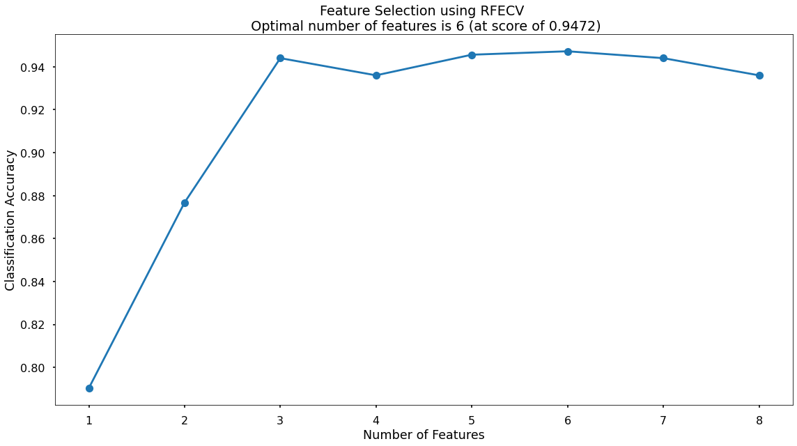
The below code then produced a plot that visualized the cross-validated classification accuracy with each potential number of features
plt.style.use('seaborn-poster')
plt.plot(range(1, len(fit.cv_results_['mean_test_score']) + 1), fit.cv_results_['mean_test_score'], marker = "o")
plt.ylabel("Classification Accuracy")
plt.xlabel("Number of Features")
plt.title(f"Feature Selection using RFECV \n Optimal number of features is {optimal_feature_count} (at score of {round(max(fit.cv_results_['mean_test_score']),4)})")
plt.tight_layout()
plt.show()
This created the below plot, which showed me that the highest cross-validated classification accuracy (0.9472) was when I included six of my original input variables - although there wasn’t much difference in predictive performance between using three variables through to eight variables - and this synced with what I saw in the Random Forest section above where only three of the input variables scored highly when assessing Feature Importance & Permutation Importance.
The variables that had been dropped were total_items and credit score - I continued with the remaining six!
Model Training
Instantiating and training my KNN model was done using the below code. At this stage I just used the default parameters, meaning that the algorithm:
- used a value for k of 5, or in other words it based classifications based upon the 5 nearest neighbors
- used uniform weighting, or in other words an equal weighting to all 5 neighbors regardless of distance
# Instantiate our model object
clf = KNeighborsClassifier()

# Fit our model using our training & test sets
clf.fit(X_train, y_train)
Model Performance Assessment
Predict On The Test Set
# Predict on the test set
y_pred_class = clf.predict(X_test)
y_pred_prob = clf.predict_proba(X_test)[:,1]
Confusion Matrix
The below code created the Confusion Matrix using the confusion_matrix functionality from within scikit-learn and then plotted it using matplotlib.
# Create the confusion matrix
conf_matrix = confusion_matrix(y_test, y_pred_class)

# Plot the confusion matrix
plt.style.use("seaborn-poster")
plt.matshow(conf_matrix, cmap = "coolwarm")
plt.gca().xaxis.tick_bottom()
plt.title("Confusion Matrix")
plt.ylabel("Actual Class")
plt.xlabel("Predicted Class")
for (i, j), corr_value in np.ndenumerate(conf_matrix):
    plt.text(j, i, corr_value, ha = "center", va = "center", fontsize = 20)
plt.show()
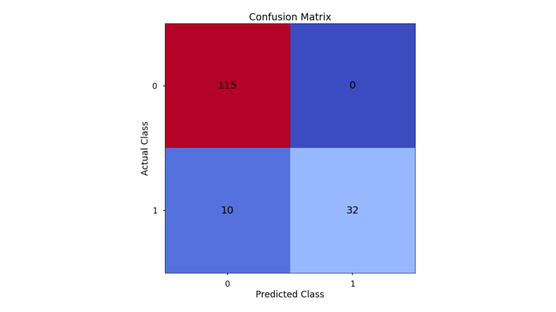
The aim was to have a high proportion of observations falling into the top left cell (predicted non-signup and actual non-signup) and the bottom right cell (predicted signup and actual signup).
The results here were interesting - all of the errors were where the model incorrectly classified delivery club signups as non-signups - the model made no errors when classifying non-signups non-signups.
Since the proportion of signups in my data was around 30:70 I next analyzed not only Classification Accuracy, but also Precision, Recall, and F1-Score which will help us assess how well my model had performed in reality.
Classification Performance Metrics
Accuracy, Precision, Recall, F1-Score
# Classification accuracy
accuracy_score(y_test, y_pred_class)

# Precision
precision_score(y_test, y_pred_class)

# Recall
recall_score(y_test, y_pred_class)

# F1-score
f1_score(y_test, y_pred_class)
Running this code gives us:
- Classification Accuracy = 0.936 meaning I correctly predicted the class of 93.6% of test set observations
- Precision = 1.00 meaning that for my predicted delivery club signups, I was correct 100% of the time
- Recall = 0.762 meaning that of all actual delivery club signups, I predicted correctly 76.2% of the time
- F1-Score = 0.865
These were interesting. The KNN had obtained the highest overall Classification Accuracy & Precision, but the lower Recall score had penalized the F1-Score meaning that was lower than what was seen for both the Decision Tree & the Random Forest!
Finding The Optimal Value For k
By default, the KNN algorithm within scikit-learn uses k = 5 meaning that classifications are based upon the five nearest neighboring data points in n-dimensional space.
Just because this is the default threshold does not mean it is the best one for our task.
Here, I tested many potential values for k, and plotted the Precision, Recall & F1-Score, and find an optimal solution!
# Set up range for search, and empty list to append accuracy scores to
k_list = list(range(2,25))
accuracy_scores = []

# Loop through each possible value of k, train and validate model, append test set f1-score
for k in k_list:

    clf = KNeighborsClassifier(n_neighbors = k)
    clf.fit(X_train,y_train)
    y_pred = clf.predict(X_test)
    accuracy = f1_score(y_test,y_pred)
    accuracy_scores.append(accuracy)

# Store max accuracy, and optimal k value
max_accuracy = max(accuracy_scores)
max_accuracy_idx = accuracy_scores.index(max_accuracy)
optimal_k_value = k_list[max_accuracy_idx]

# Plot accuracy by max depth
plt.plot(k_list,accuracy_scores)
plt.scatter(optimal_k_value, max_accuracy, marker = "x", color = "red")
plt.title(f"Accuracy (F1 Score) by k \n Optimal Value for k: {optimal_k_value} (Accuracy: {round(max_accuracy,4)})")
plt.xlabel("k")
plt.ylabel("Accuracy (F1 Score)")
plt.tight_layout()
plt.show()
That code gave me the below plot - which visualized the results!
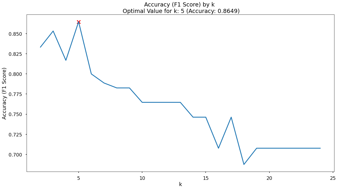
In the plot I saw that the maximum F1-Score on the test set was found when applying a k value of 5 - which was exactly what I started with, so nothing needed to change!
Modeling Summary
The goal of the project was to build a model that would accurately predict the customers that would sign up for the delivery club. This would allow for a much more targeted approach when running the next iteration of the campaign. A secondary goal was to understand what the drivers for this are, so the client can get closer to the customers that need or want this service, and enhance their messaging.
Based upon these, the chosen model is the Random Forest as it was a) the most consistently performant on the test set across classification accuracy, precision, recall, and f1-score, and b) the feature importance and permutation importance allows the client an understanding of the key drivers behind delivery club signups.
Metric 1: Classification Accuracy
- KNN = 0.936
- Random Forest = 0.935
- Decision Tree = 0.929
- Logistic Regression = 0.866
Metric 2: Precision
- KNN = 1.00
- Random Forest = 0.887
- Decision Tree = 0.885
- Logistic Regression = 0.784
Metric 3: Recall
- Random Forest = 0.904
- Decision Tree = 0.885
- KNN = 0.762
- Logistic Regression = 0.69
Metric 4: F1 Score
- Random Forest = 0.895
- Decision Tree = 0.885
- KNN = 0.865
- Logistic Regression = 0.734
Application
I now have a model object, and the required pre-processing steps to use this model for the next delivery club campaign. When this is ready to launch I can aggregate the necessary customer information and pass it through, obtaining predicted probabilities for each customer signing up.
Based upon this, I can work with the client to discuss where their budget can stretch to, and contact only the customers with a high propensity to join. This will drastically reduce marketing costs, and result in a much improved ROI.
Growth & Next Steps
I could look to tune the hyperparameters of the Random Forest, notably regularisation parameters such as tree depth, as well as potentially training on a higher number of Decision Trees in the Random Forest.
From a data point of view, further variables could be collected, and further feature engineering could be undertaken to ensure that I have as much useful information available for predicting customer loyalty.