Predicting Ad Clicks- Forecasting User Engagement in Digital Advertising
In this project, we will try to create a model that will predict whether or not a particular internet user will click on an ad based off the features of that user. For that, we will be working with a fake advertising data set, indicating whether or not a particular internet user clicked on an Advertisement.
This data set contains the following features:
- ‘Daily Time Spent on Site’: consumer time on site in minutes
- ‘Age’: customer age in years
- ‘Area Income’: Avg. Income of geographical area of consumer
- ‘Daily Internet Usage’: Avg. minutes a day consumer is on the internet
- ‘Ad Topic Line’: Headline of the advertisement
- ‘City’: City of consumer
- ‘Male’: Whether or not the consumer was male
- ‘Country’: Country of consumer
- ‘Timestamp’: The time at which the consumer clicks on Ad or closes window
- ‘Clicked on Ad’: 0 or 1 indicated clicking on Ad
Import Required Packages
import pandas as pd
import numpy as np
import matplotlib.pyplot as plt
import seaborn as sns
%matplotlib inline
Import Data
ad_data = pd.read_csv('advertising.csv')
Check the head of ad_data
ad_data.head()
| Daily Time Spent on Site | Age | Area Income | Daily Internet Usage | Ad Topic Line | City | Male | Country | Timestamp | Clicked on Ad | |
|---|---|---|---|---|---|---|---|---|---|---|
| 0 | 68.95 | 35 | 61833.90 | 256.09 | Cloned 5thgeneration orchestration | Wrightburgh | 0 | Tunisia | 2016-03-27 00:53:11 | 0 |
| 1 | 80.23 | 31 | 68441.85 | 193.77 | Monitored national standardization | West Jodi | 1 | Nauru | 2016-04-04 01:39:02 | 0 |
| 2 | 69.47 | 26 | 59785.94 | 236.50 | Organic bottom-line service-desk | Davidton | 0 | San Marino | 2016-03-13 20:35:42 | 0 |
| 3 | 74.15 | 29 | 54806.18 | 245.89 | Triple-buffered reciprocal time-frame | West Terrifurt | 1 | Italy | 2016-01-10 02:31:19 | 0 |
| 4 | 68.37 | 35 | 73889.99 | 225.58 | Robust logistical utilization | South Manuel | 0 | Iceland | 2016-06-03 03:36:18 | 0 |
** Use info and describe() on ad_data**
ad_data.info()
<class 'pandas.core.frame.DataFrame'>
RangeIndex: 1000 entries, 0 to 999
Data columns (total 10 columns):
 #   Column                    Non-Null Count  Dtype
---  ------                    --------------  -----
 0   Daily Time Spent on Site  1000 non-null   float64
 1   Age                       1000 non-null   int64
 2   Area Income               1000 non-null   float64
 3   Daily Internet Usage      1000 non-null   float64
 4   Ad Topic Line             1000 non-null   object
 5   City                      1000 non-null   object
 6   Male                      1000 non-null   int64
 7   Country                   1000 non-null   object
 8   Timestamp                 1000 non-null   object
 9   Clicked on Ad             1000 non-null   int64
dtypes: float64(3), int64(3), object(4)
memory usage: 78.2+ KB
ad_data.describe()
| Daily Time Spent on Site | Age | Area Income | Daily Internet Usage | Male | Clicked on Ad | |
|---|---|---|---|---|---|---|
| count | 1000.000000 | 1000.000000 | 1000.000000 | 1000.000000 | 1000.000000 | 1000.00000 |
| mean | 65.000200 | 36.009000 | 55000.000080 | 180.000100 | 0.481000 | 0.50000 |
| std | 15.853615 | 8.785562 | 13414.634022 | 43.902339 | 0.499889 | 0.50025 |
| min | 32.600000 | 19.000000 | 13996.500000 | 104.780000 | 0.000000 | 0.00000 |
| 25% | 51.360000 | 29.000000 | 47031.802500 | 138.830000 | 0.000000 | 0.00000 |
| 50% | 68.215000 | 35.000000 | 57012.300000 | 183.130000 | 0.000000 | 0.50000 |
| 75% | 78.547500 | 42.000000 | 65470.635000 | 218.792500 | 1.000000 | 1.00000 |
| max | 91.430000 | 61.000000 | 79484.800000 | 269.960000 | 1.000000 | 1.00000 |
Exploratory Data Analysis
We will use seaborn to explore the data!
** Create a histogram of the Age**
sns.set_style('whitegrid')
ad_data['Age'].hist(bins = 30)
plt.xlabel('Age')
Text(0.5, 0, 'Age')
Create a jointplot showing Area Income versus Age.
sns.jointplot(data=ad_data, x= 'Age', y= 'Area Income')
<seaborn.axisgrid.JointGrid at 0x1fe36fcc6d0>
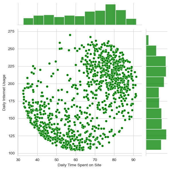
** Create a jointplot of ‘Daily Time Spent on Site’ vs. ‘Daily Internet Usage’**
sns.jointplot(x='Daily Time Spent on Site',y='Daily Internet Usage',data=ad_data,color='green')
<seaborn.axisgrid.JointGrid at 0x1fe36a78c10>
** Finally, create a pairplot with the hue defined by the ‘Clicked on Ad’ column feature.**
sns.pairplot(ad_data,hue='Clicked on Ad')
<seaborn.axisgrid.PairGrid at 0x1fe377fba60>
Logistic Regression
Now it’s time to do a train test split, and train our model!
** Define input and output variables**
X = ad_data[['Daily Time Spent on Site', 'Age', 'Area Income','Daily Internet Usage', 'Male']]
y = ad_data['Clicked on Ad']
** Split the data into training set and testing set using train_test_split**
from sklearn.model_selection import train_test_split

X_train, X_test, y_train, y_test = train_test_split(X, y, test_size=0.33, random_state=42)
** Train and fit a logistic regression model on the training set.**
from sklearn.linear_model import LogisticRegression

clf = LogisticRegression()
clf.fit(X_train, y_train)
LogisticRegression()In a Jupyter environment, please rerun this cell to show the HTML representation or trust the notebook.
On GitHub, the HTML representation is unable to render, please try loading this page with nbviewer.org.
LogisticRegression()
Predictions and Evaluations
** Now predict values for the testing data.**
y_predict = clf.predict(X_test)
** Create a classification report for the model.**
from sklearn.metrics import classification_report

print(classification_report(y_test,y_predict))
              precision    recall  f1-score   support

           0       0.86      0.96      0.91       162
           1       0.96      0.85      0.90       168

    accuracy                           0.91       330
   macro avg       0.91      0.91      0.91       330
weighted avg       0.91      0.91      0.91       330
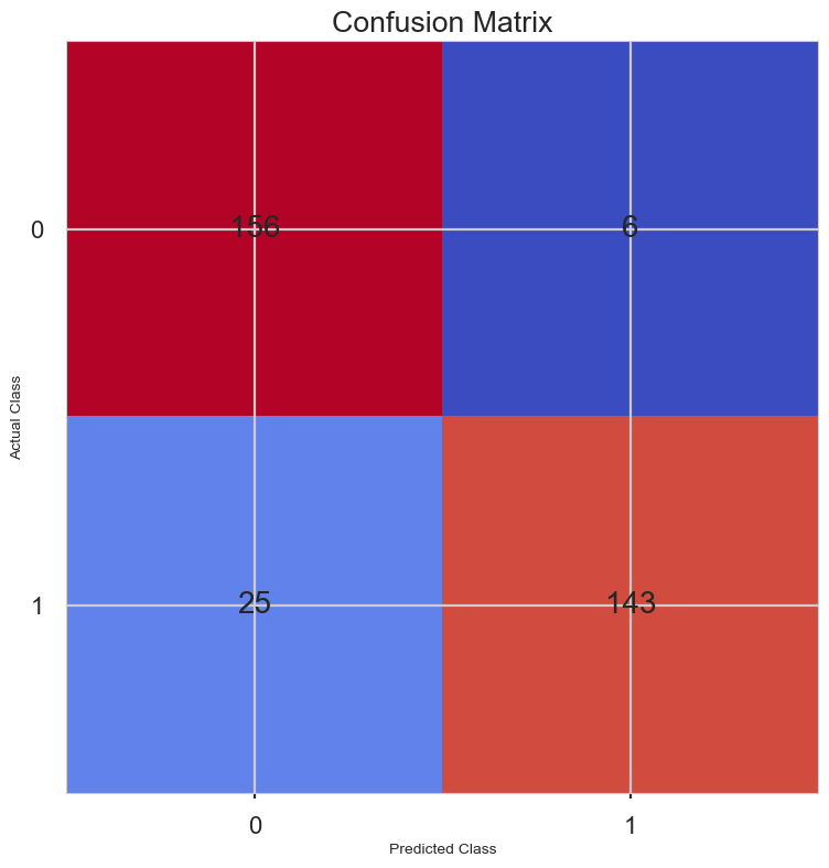
from sklearn.metrics import confusion_matrix

conf_matrix = confusion_matrix(y_test, y_predict)
print(conf_matrix)

plt.style.use('seaborn-poster')
plt.matshow(conf_matrix, cmap = 'coolwarm')
plt.gca().xaxis.tick_bottom()
plt.title('Confusion Matrix')
plt.ylabel('Actual Class')
plt.xlabel('Predicted Class')
for (i, j), corr_value in np.ndenumerate(conf_matrix):
    plt.text(j, i, corr_value, ha = 'center', va = 'center', fontsize = 20)
plt.show()
[[156   6]
 [ 25 143]]